Navigation Redesign
Reimagined the navigation system to elevate UX and brand digital presence.
- Role
- Senior Product Designer
- Timeframe
- 2021–2024
- Key Tasks
- Information Architecture
- Content Inventory
- Tree Testing
- Prototyping
- Tools
- Figma
- Miro
- UserTesting
01Background
Navigation is the foundation of any digital experience.
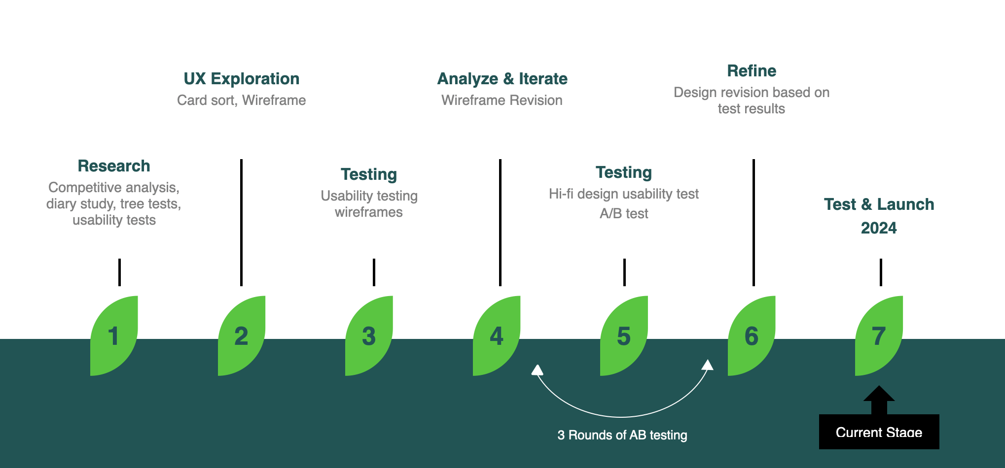
The existing navigation had been designed and launched three years earlier. Since then, we had continuously monitored its usability and performance. A series of research studies and tests led to the full redesign.
Sep 2021
Benchmark tree test
Nov 2021
Browse Aisles diary study
Dec 2021
Benchmark usability test
Feb 2022
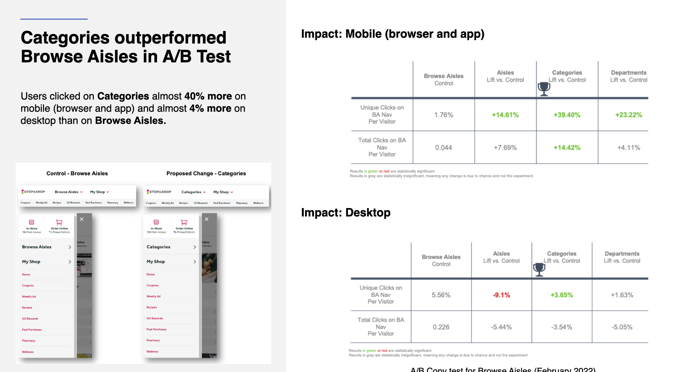
A/B copy test
Feb 2022
Browse Aisles open card sort
Apr 2022
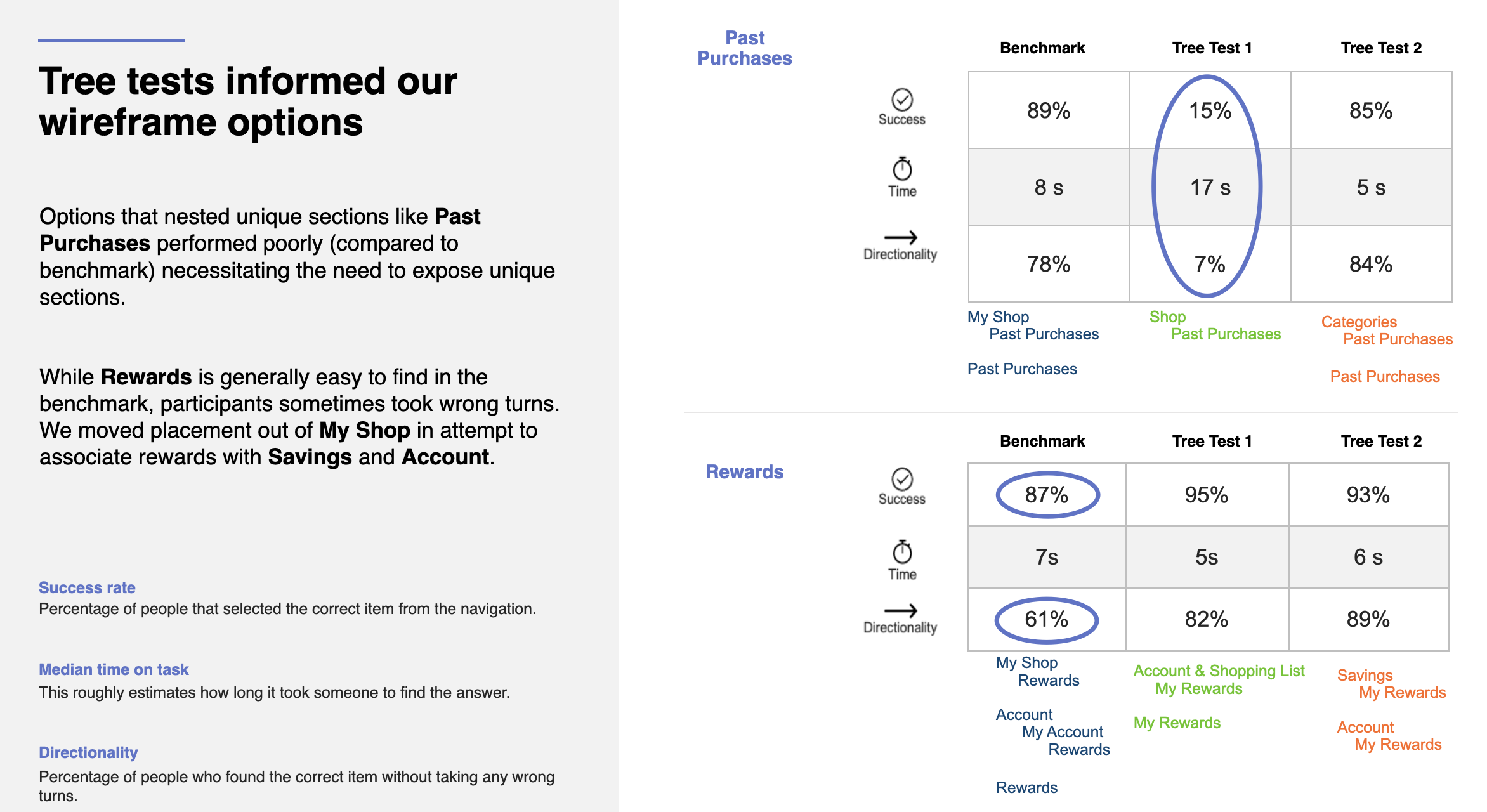
Tree tests to inform IA
02The Problem
Make discovery easier, and inspiration easier to find.
Low findability
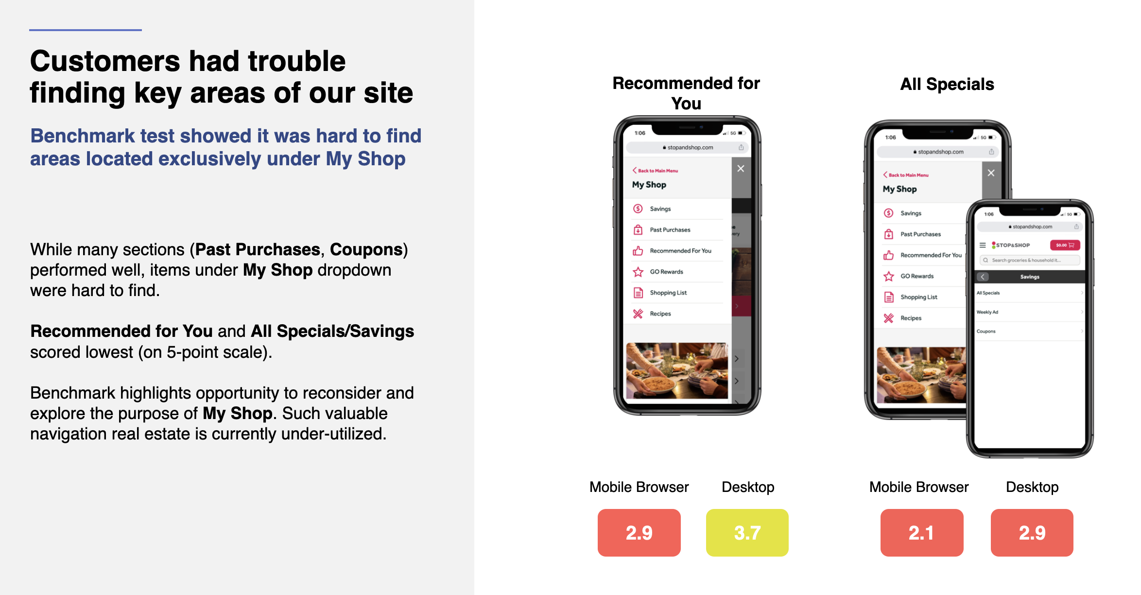
Mission-critical pages received insufficient within-site traffic because they were difficult to find in the navigation.
The Recommended for You page received less than 1% of site traffic.
Lacking inspiration
There were limited opportunities for cross-category exploration and insufficient traffic to seasonal or inspirational content.
Over 80% of add-to-carts came through direct search.
Complex IA
Confusing information architecture and taxonomy made it difficult for customers to find products and stay oriented.
In the taxonomy test, the control group performed significantly worse than the alternatives.
03Our Approach
Build confidence through research and testing.
Changes to navigation can significantly affect site performance and revenue. We combined qualitative and quantitative methods to build confidence in the final design, using workshops, interviews, card sorting, tree testing, moderated and unmoderated usability testing, and full-stack A/B tests.
Additional learnings
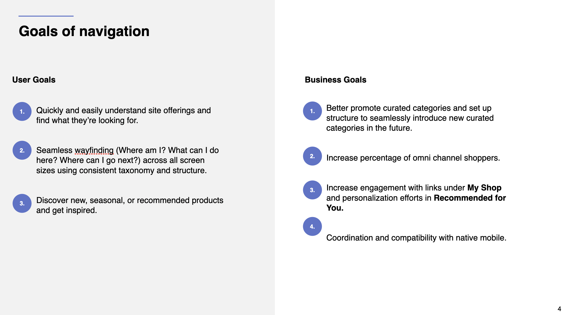
Designers and product owners worked closely to define user and business objectives and measures of success. With these goals aligned, we conducted open card sorting, tree testing, benchmark testing, and A/B testing for taxonomy. After numerous workshops and reviews, we were ready to explore.
04Exploration
Explore solutions
My favorite UX exercise is whiteboarding, whether in FigJam or on a physical board. It helps designers get ideas out quickly without getting caught in the details.
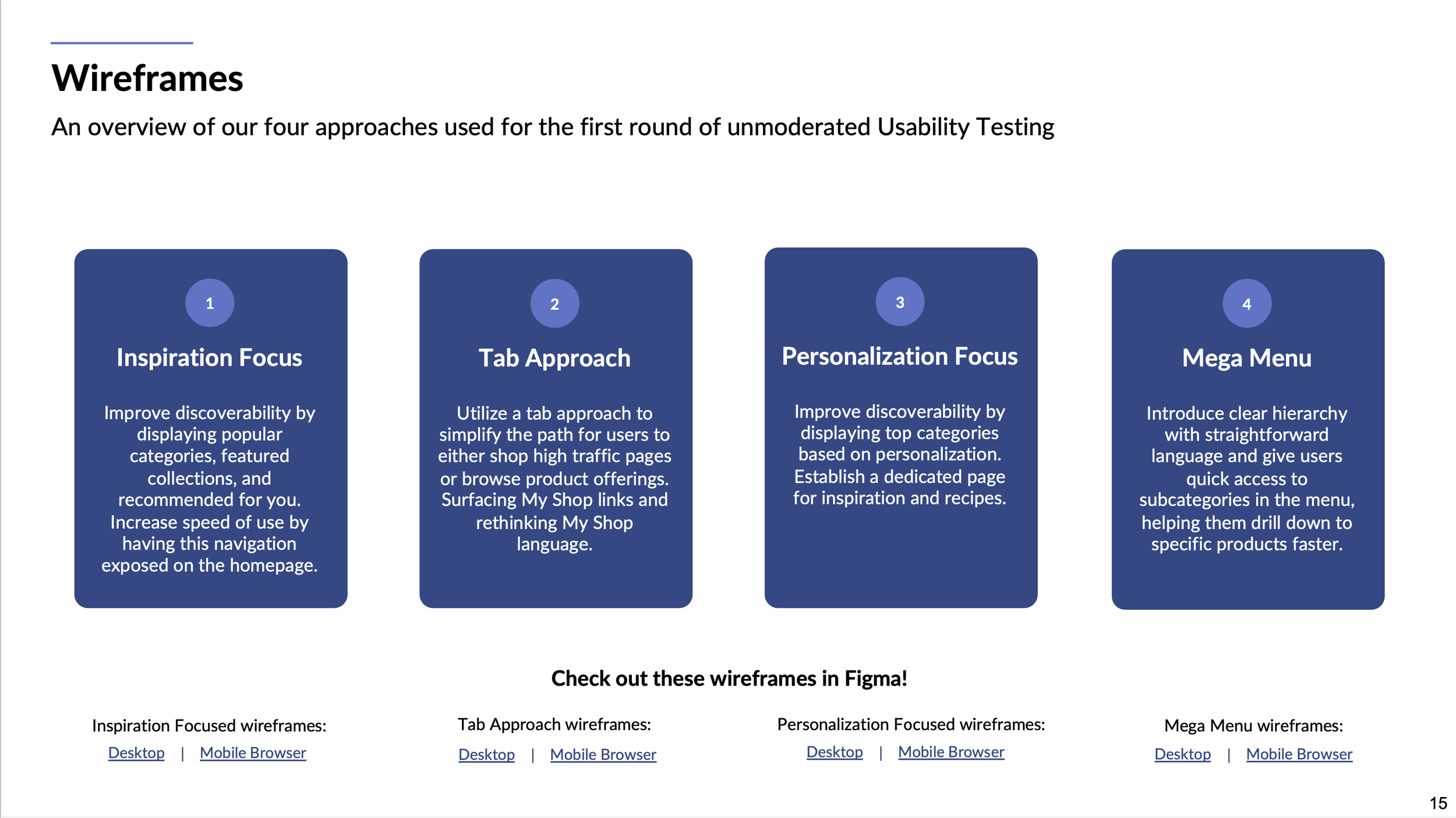
We began with a team-wide whiteboarding session and narrowed the ideas to four approaches. A quick round of unmoderated usability testing identified two winning directions, which we developed into high-fidelity design mockups.
Design goal · 01
Inspire our customers
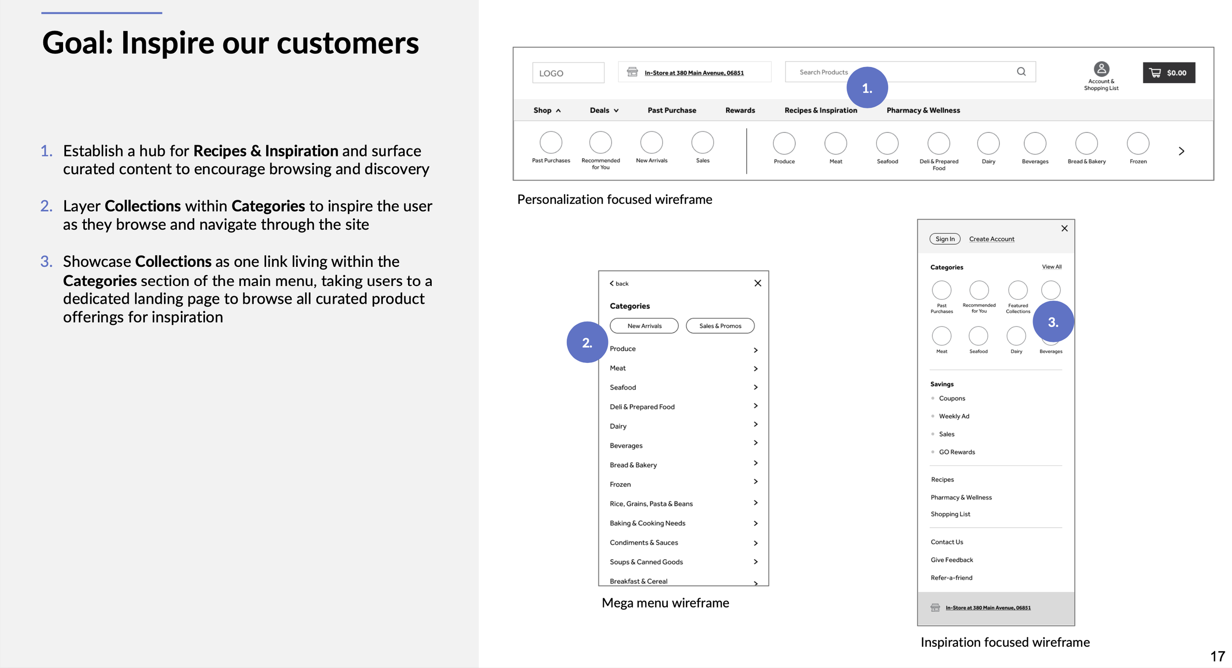
Design goal · 02
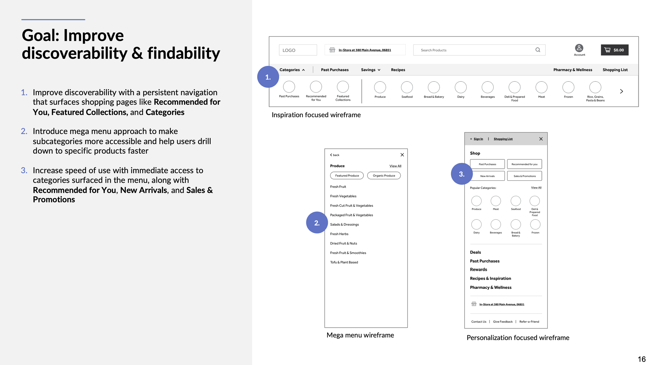
Improve discoverability & findability
Design goal · 03
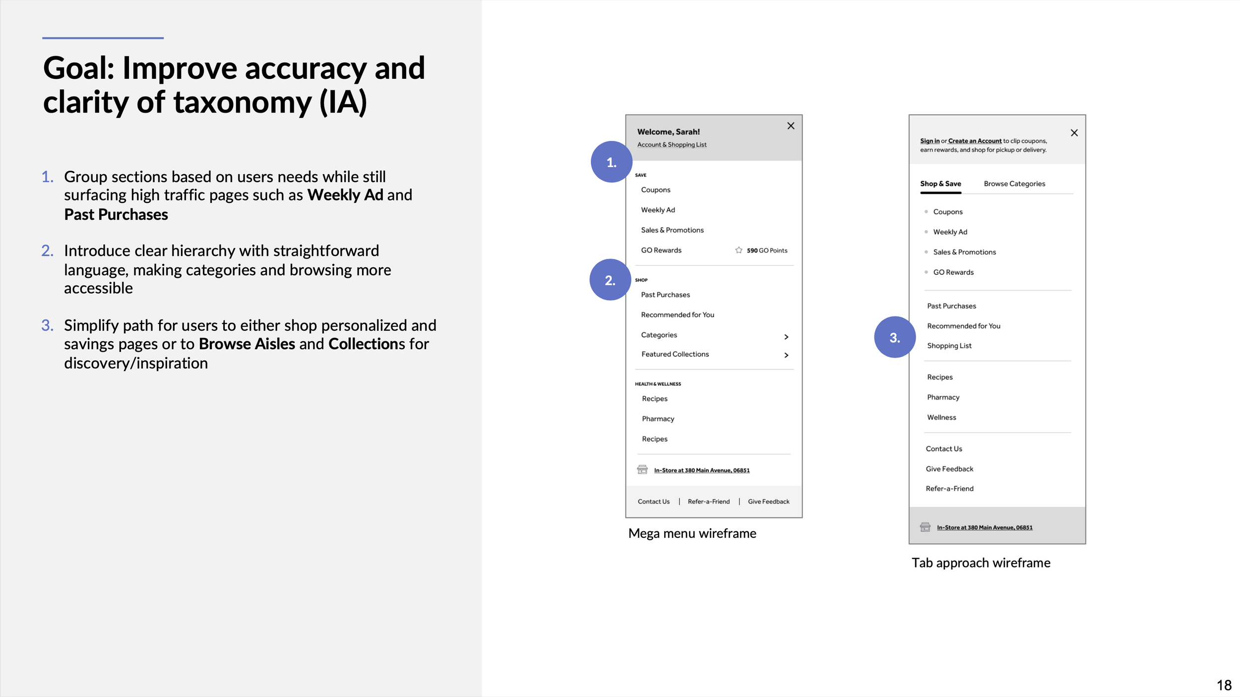
Improve accuracy and clarity of taxonomy
05The Solution
The winning solution
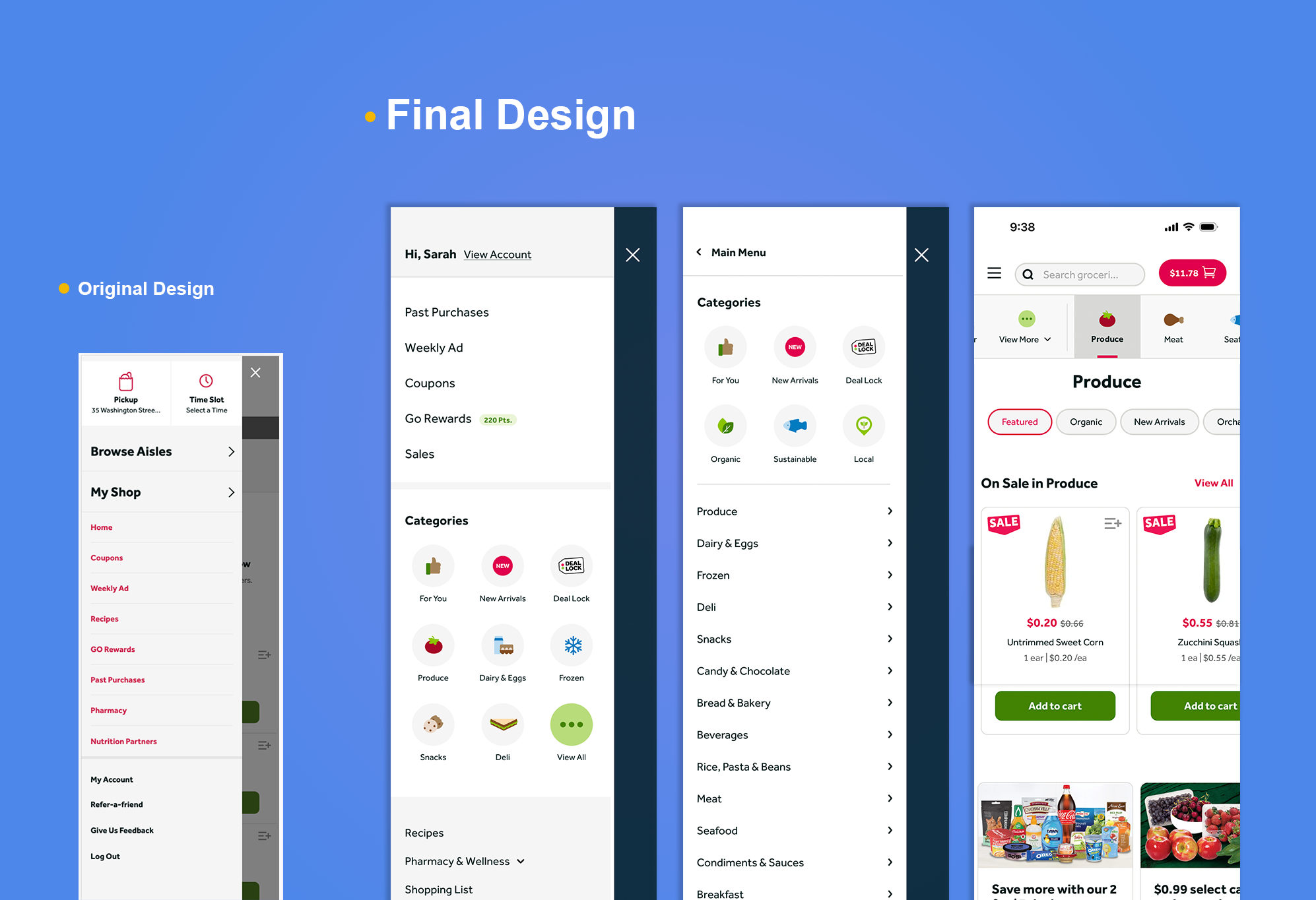
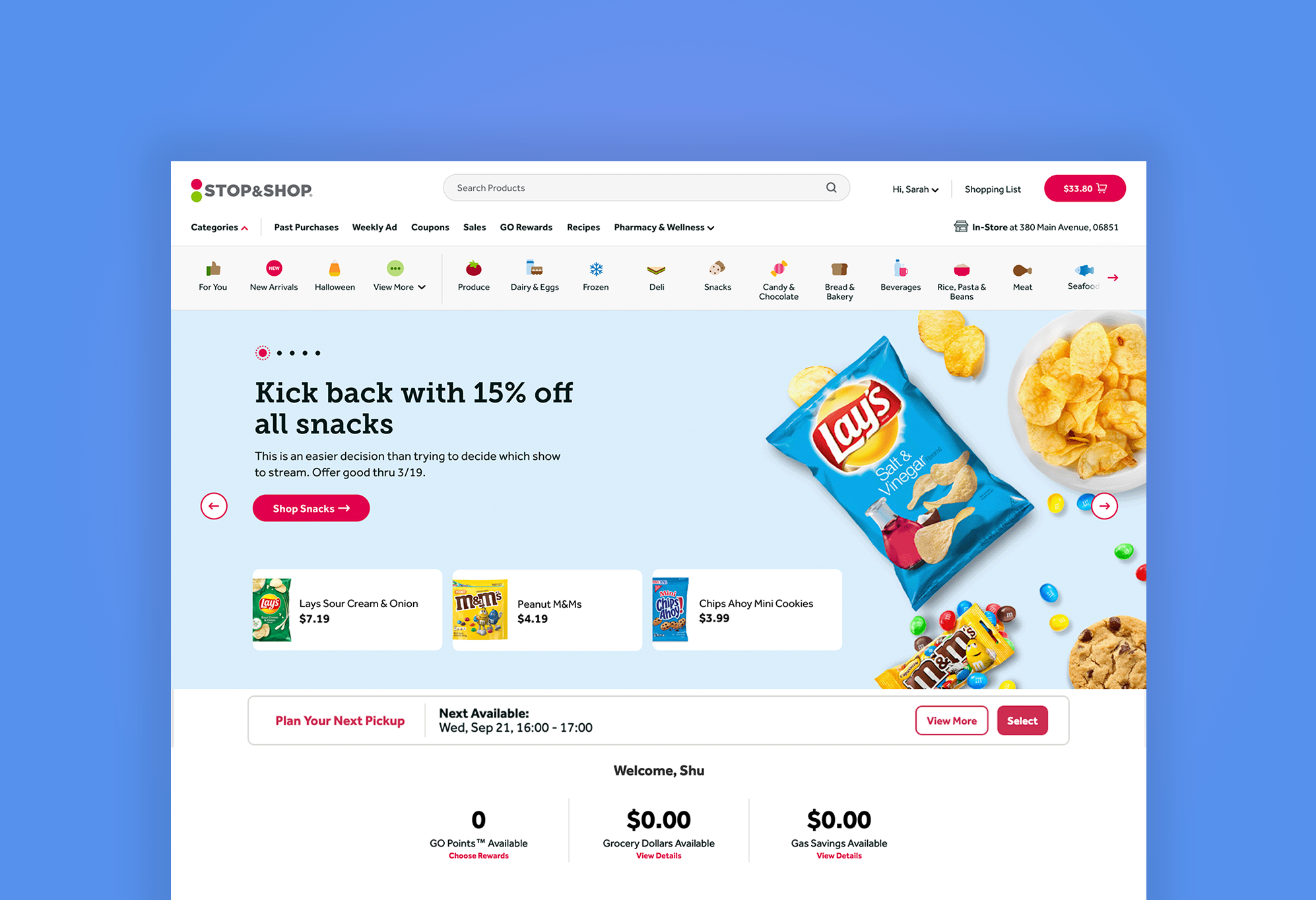
The final design exposes Browse Aisle categories upon landing on the homepage, helping users quickly drill down to the category they want. High-revenue pages remain in the primary navigation and are easy to access throughout the experience. Iconography draws attention and elevates the digital brand experience.
06The Impact
Measured through three rounds of A/B testing.
We worked closely with engineering and analytics teams to launch three rounds of full-stack A/B tests. Each test split site traffic equally between control and test groups.
- Primary navigation click-through
- +12.48%
- Category page views
- +73.19%
- Category page add-to-carts
- +48%
- Seasonal page views
- +4.12%
Way finding
Measure click-through rates, especially in underperforming areas.
Purchase behavior
Track add-to-cart behavior to understand how users find products and where they add them to their carts.
General metrics
Monitor whether the new design negatively affects overall site performance.
Business metrics
Monitor conversion rate, basket size, average order value, and revenue per visitor to guard against negative commerce impacts.